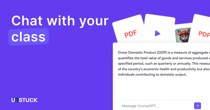
Unstuck positions itself as an AI study assistant that can turn lectures, PDFs, and videos into structured notes and quizzes. On paper, the promise is appealing, especially for students dealing with content overload. However, the real first impression depends heavily on what the platform actually lets you access without upgrading.
Based on hands-on observation, the experience is more restricted than many descriptions suggest. Before treating Unstuck as a fully usable free study tool, it is important to understand how the access flow and visibility actually work in practice.
The First Impression: A Paywall-First Experience
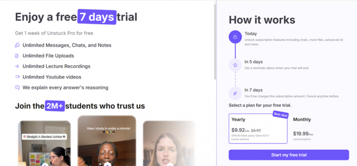
One of the most noticeable friction points appears immediately after landing on the site. Instead of being able to explore the workspace freely, users are pushed toward the free trial or paid plan selection very early in the flow.
In practical terms, this creates a gated experience rather than a true try-before-you-commit environment.
What Stands Out
• The interface heavily promotes the 7 day trial
• Core functionality is difficult to preview without upgrading
• Navigation beyond the introductory layer feels limited
• Users may feel nudged into selecting a plan before fully evaluating the tool
This does not automatically make the product ineffective, but it does change the expectation. The platform behaves more like a subscription-first service than an openly explorable study tool.
Pricing Visibility and Trial Positioning
From the current interface, pricing is clearly front and center.
Observed Plan Display
| Plan Type | Displayed Price | Billing Note | Positioning |
| Yearly | About $9.92 per month | Billed annually at $119 | Marked as best deal |
| Monthly | $19.99 per month | Cancel anytime | Standard option |
The free trial is advertised as 7 days of Pro access, but the surrounding UI strongly encourages plan selection early in the process.
Practical Interpretation
• The platform is not fully usable in a meaningful way without upgrading
• The free experience functions more like a preview funnel
• Heavy study workflows will almost certainly require the paid tier
• Pricing is typical for the category, but the gating feels aggressive
Students expecting a generous free sandbox may find the entry flow tighter than expected.
Interface and Navigation Gaps
Another notable observation is the limited visible site depth from the public facing pages.
Structural Friction
• The experience feels concentrated around a single primary landing flow
• Secondary pages and deeper navigation are not clearly surfaced
• The overall site structure can feel thin or incomplete
• It is not immediately obvious where to explore beyond the trial funnel
This creates a slightly off balance first impression. For a study platform, users typically expect a clearer product walkthrough before committing.
Contact and Trust Signals
One area where the platform currently feels underdeveloped is transparency around support and contact access.
What Appears Limited
• No clearly visible direct contact button in the main flow
• Support pathways are not prominently surfaced
• Trust signals are lighter than expected for an education focused tool
• Users may need to dig to find help channels
This does not necessarily indicate a problem with the product itself, but it does affect perceived reliability, especially for students considering a paid subscription.
How Unstuck Rates Across Markets
Beyond the in-app experience, it is worth checking how Unstuck is received on the platforms where users actually rate it. The app (published as "Unstuck AI Note Taker" by Quizard AI) has crossed 364K+ downloads, and its store ratings look strong at first glance. The fuller picture only appears when the headline stars are set against third-party trust analysis and the written reviews behind them.
Ratings by Platform
| Platform | Score | Volume | What It Reflects |
|---|---|---|---|
| Apple App Store (iOS) | 4.7 / 5 | ~2,300 ratings | Strong surface rating |
| Google Play (Android) | 4.7 / 5 | ~2,500 ratings | Matches the iOS surface rating |
| JustUseApp (safety score) | 28.8 / 100 | 2,326 reviews analyzed | Third-party flag on billing and reliability |
| Trustpilot | Not listed | — | No verified business profile found |
| G2 / Capterra | Not listed | — | Consumer study app, outside B2B directories |
| Product Hunt | No footprint | — | No meaningful community review presence |
What the Ratings Don't Show
- Many of the most positive reviews describe strong first impressions, while a recurring set of critical reviews describes problems that appear with continued use
- Several users report the app crashing mid-lecture, and in some cases deleting a full recording before an exam
- Transcripts and summaries are described by some reviewers as thin or overly basic, particularly for STEM subjects
- The most serious and repeated complaints involve billing: unexpected annual charges, charges after cancellation, and slow or missing refund support, often resolved through Apple rather than Unstuck
- The low third-party safety score reflects these billing and reliability signals far more than the 4.7 star average does
- No independent review platform (Trustpilot, G2, Product Hunt) currently corroborates the app-store ratings
In short, the star ratings are genuinely high, but they sit on top of reliability and billing concerns that a first-time buyer would not see from the store page alone. For a subscription-first tool, that gap between surface rating and underlying trust is the part worth weighing before paying.
Where Unstuck Still Shows Potential
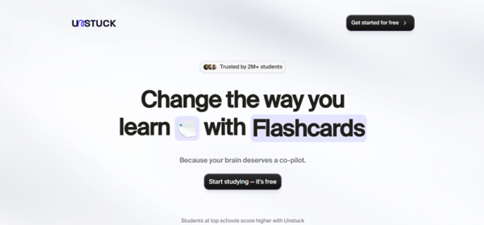
Even with the gating concerns, the core concept behind Unstuck remains relevant. The idea of chatting with course materials and auto generating structured notes addresses a real student pain point.
When the system is accessible, the workflow direction makes sense for:
• Lecture heavy courses
• Large PDF based subjects
• Students managing multiple content sources
• Users who prefer guided study workflows
The key question is not whether the concept is useful. It is whether the current product experience matches the expectation being set.
Friction Points
Limitations and Concerns
• Very limited meaningful access before upgrading
• Trial funnel is highly prominent and somewhat pushy
• Site depth and navigation feel thin
• Contact visibility is weak
• Overall trust signals could be stronger
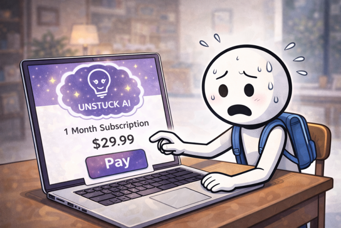
• Users may feel forced into payment too early
Who Should Approach With Extra Caution
• Students expecting a generous free tier
• Users who want to fully explore before paying
• Anyone sensitive to subscription-first funnels
• First time AI study tool users who want a guided walkthrough
If you are comfortable testing through a trial, the platform may still be worth evaluating. If you prefer fully open exploration before committing, the current flow may feel restrictive.
Final Verdict
Unstuck is built around a genuinely useful idea: turning raw study material into structured learning assets through AI. The academic workflow it targets is real, and the underlying direction makes sense for modern students.
However, the current front end experience feels heavily paywall driven. Visibility into the product before upgrading is limited, navigation depth appears thin, and trust signals such as clear contact pathways are not as prominent as many students would expect.
In its present form, Unstuck looks more like a subscription first study tool than a freely explorable AI assistant. Students who are comfortable entering through a trial may still find value. Those hoping to properly evaluate the platform before paying may come away slightly unconvinced.
Post Comment
Be the first to post comment!