On This Page
- What Techsslaash.com Really Is
- Domain Focus & Topical Authority: The First SEO Filter
- Backlink Reality Check: Dofollow ≠ Valuable
- Indexation & Longevity: Will Your Link Even Survive?
- Editorial Review Claims vs Observable Signals
- User Experience & Site Health
- When Techsslaash Can Still Make Sense
- Final Verdict
If you’re evaluating Techsslaash.com purely as an SEO asset, not as a reader, not as a contributor, but as a link-builder, the question isn’t “What does the site claim?”
The real question is:
Does publishing on Techsslaash.com create SEO value that outweighs the risk?
This guide breaks down Techsslaash as it actually functions today, how Google is likely to interpret it, and whether it belongs in a modern backlink strategy.
Search Intent Clarification
People searching for this topic usually want answers to:
- Is Techsslaash good for guest posting SEO?
- Are the backlinks dofollow and indexed?
- Does Google treat it as trustworthy or risky?
- Is it worth time compared to better alternatives?
This review is written strictly to answer those intent signals, not to promote the platform.
What Techsslaash.com Really Is
Techsslaash presents itself as:
- a tech publishing platform
- offering SEO-optimized guest posts
- with reward systems, dashboards, and analytics
In reality, based on on-site structure and content patterns, it behaves more like:
- A multi-category content site (tech + non-tech mixed)
- With open contribution signals
- Minimal visible editorial enforcement
- Heavy outbound linking across unrelated niches
This distinction matters because Google evaluates sites based on behavior, not claims.
Domain Focus & Topical Authority: The First SEO Filter
Why topical authority matters
- Google increasingly rewards sites that:
- stay within a tight topical cluster
- demonstrate subject-matter depth
- avoid unrelated outbound linking patterns
Techsslaash’s problem
Techsslaash does not operate as a pure tech authority.
Observed issues:
- Tech articles coexist with lifestyle, general blogging, and unrelated commercial topics
- No visible topical silos or strict category enforcement
- Weak internal linking between related tech content
SEO impact:
Backlinks from broad, unfocused sites tend to pass less topical relevance, even if they are technically dofollow.
Backlink Reality Check: Dofollow ≠ Valuable
What most SEOs misunderstand
A backlink being dofollow does not automatically mean:
- ranking improvement
- authority transfer
- long-term value
Google evaluates:
- page quality
- outbound link neighborhood
- editorial intent
- indexing stability
Risk signals observed
- Pages with multiple external links
- Footer-level outbound links to unrelated niches
- Lack of visible editorial guidelines
Even if Techsslaash provides a dofollow link, its link equity dilution risk is high.
Indexation & Longevity: Will Your Link Even Survive?
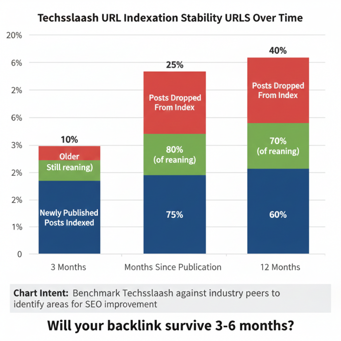
Before using any site for SEO, ask:
- Does Google consistently index new posts?
- Do URLs remain stable over time?
- Are older posts still searchable via
site:queries?
With Techsslaash:
- Indexation appears inconsistent
- No public archive or editorial history transparency
- No guarantee posts won’t be removed, edited, or deindexed
SEO takeaway:
Unstable pages = unstable backlinks = unreliable ranking signals.
Editorial Review Claims vs Observable Signals
The site claims:
- editorial checks
- quality assurance
- plagiarism control
What’s missing:
- Named editors
- Clear contributor guidelines
- Rejection criteria
- Publishing timelines
- Revision or feedback workflow
From Google’s perspective, absence of visible editorial governance weakens trust signals.
User Experience & Site Health
While UX doesn’t directly pass link equity, it influences:
- crawl behavior
- quality scoring
- long-term trust
Observed issues:
- Broken or incomplete submission flows
- No working analytics dashboards
- Limited support visibility
- Heavy footer clutter
These are classic indicators of low maintenance priority, which indirectly affects SEO trust.
When Techsslaash Can Still Make Sense
Techsslaash is not useless, but it should be used strategically and sparingly.
Acceptable SEO use cases
- Brand mention diversification
- Low-risk branded anchors
- Tier-2 or Tier-3 link support
- Content testing (not authority building)
Use cases to avoid
- Money keyword anchors
- Homepage or service page links
- Core authority link building
- Client-facing “clean link profiles”
How to Publish Safely If You Still Choose to Use It
If you proceed, reduce footprint risk:
Content
- Publish a genuine tutorial or analysis
- Avoid SEO-stuffed intros
- Add real examples or visuals
Links
- Max 1–2 outbound links
- Use branded or neutral anchors only
- No exact-match commercial anchors
Structure
- Link to authoritative external references
- Avoid affiliate or sales language
- Make the post useful even without the backlink
This helps Google interpret the article as content-driven, not link-driven.
Comparison: Techsslaash vs High-Trust SEO Publishing Platforms
| Factor | Techsslaash | High-Trust Tech Publishers |
|---|---|---|
| Editorial oversight | Weak / unclear | Strong, named editors |
| Topical focus | Broad | Narrow & deep |
| Outbound link hygiene | Risky | Controlled |
| Index stability | Uncertain | High |
| Long-term SEO value | Low–medium | High |
Final Verdict
Techsslaash.com does not currently qualify as a high-trust SEO asset.
It may:
- provide a dofollow link
- index temporarily
- add surface-level diversity
But it also carries:
- topical dilution risk
- outbound neighborhood risk
- longevity uncertainty
Bottom line
Use Techsslaash only as a minor, experimental component, never as a cornerstone of your SEO or backlink strategy.
If your goal is:
- ranking stability
- brand safety
- algorithm resilience
You should prioritize platforms with clear editorial control, focused topical authority, and clean link profiles.
Post Comment
Be the first to post comment!