Your team has access to more data than ever before, but if knowledge is power, why does more information so often lead to more confusion? Despite gaining advanced insights, many teams still struggle with missed deadlines, underdelivered goals, blown budgets, or misaligned priorities. If your ever-expanding spreadsheets, reports, and charts create more chaos than focus, then you need a better system for visualizing your data.
That’s where dashboards make all the difference. When built effectively, project dashboards can bring clarity, improve alignment, and help teams move faster even when more information is added. Let’s break down how to design dashboards that actually keep your team on track and make data work for you, not against you.
What an Effective Dashboard Really Looks Like
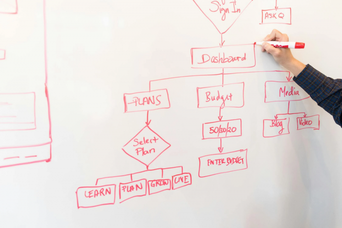
A good dashboard is more than a collection of charts. It’s a curated view of the information your team needs to do their jobs well. All too often, however, dashboards become cluttered with irrelevant details, disconnected from real business goals, or not designed with the people using them in mind. The result is an application that feels more like extra work than the helpful tool that it should be.
The ideal dashboard should answer specific questions at a glance and help your team act with confidence. Ask your leaders: What are the key questions your team needs to answer on a daily or weekly basis? Build your dashboard around those themes directly, and design with usability in mind. Here are some tips.
- Show only essential KPIs: Focus on metrics tied directly to project goals (e.g., timeline, budget, workload).
- Use clear visuals: Choose simple charts or color-coded indicators that highlight trends and status at a glance.
- Avoid clutter: Limit each view to 5–7 key data points to keep it scannable and focused.
- Organize logically: Group related info (e.g., budget and spending) and keep layouts consistent.
- Customize by role: build separate views for execs, project leads, and team members based on what they need to act on.
- Keep data fresh: Connect to live sources or automate updates to avoid outdated info.
- Set alert triggers: Flag issues like missed deadlines or over-budget spend with thresholds or status indicators.
Bonus tip: When building a collaborative technology environment, tailor dashboards to different roles. For example, a project lead needs visibility into multiple timelines and resource constraints, while a specialist needs to focus more closely on certain deliverables. Custom views help each user focus on what matters to them, without unnecessary noise.
Just like adaptive AI tools (for example, YouLearn AI), role-based dashboards make information more usable by tailoring views to different users.
Metrics That Help Teams Stay Focused
The most impactful dashboards go beyond simply reporting activity. Instead, they show progress toward broader goals and the real-time distribution of resources. Keep in mind, however, that just adding more bells and whistles is not always helpful. It’s better to track a few meaningful indicators consistently than dozens of loosely related stats. Here are some ideas for metrics to track.
Progress Toward Outcomes
Track metrics that reflect actual progress, not just activity. Instead of counting tasks completed, measure milestone achievement, deliverable status, or percentage of project completion. These indicators give a clearer view of whether your team is moving toward its goals. Align KPIs with project objectives so everyone sees how daily work contributes to the bigger picture.
Budget Health
A good project management dashboard should be able to monitor project budgets in real time. Including burn rate, forecasted costs, and budget remaining helps catch overruns early. For more detailed insights on tracking and managing project budgets effectively, resources like the guide on Lucid’s blog can be very helpful. A visual, like a cumulative spend curve or gauge chart, makes it easy to assess at a glance and make timely adjustments.
Resource Allocation
Track how team capacity is distributed across tasks or projects. Use metrics like hours assigned per team member, utilization rate, and upcoming availability. Dashboards should make it easy to visualize team workload to spot overcapacity or bottlenecks early. For example, heat maps or utilization graphs can help you see if one team is overloaded while another has bandwidth.
For teams overwhelmed by data, dashboards can even act like a “study partner.” Tools like TurboLearn AI show how AI can simplify complex material into digestible insights—a role dashboards should play for business data.
Connect the Pieces: Projects, Budgets, and Business Goals
One of the biggest reasons dashboards fail is that they show data in silos. You might have a finance dashboard, a project tracker, and a performance dashboard. Without effective integration, however, they only tell part of the story.
The importance of this is echoed by Forbes, which stresses that dashboards are central to business management because they align execution with strategy.
Research also backs this up. According to a ResearchGate study, integrating Lean, Six Sigma, and balanced scorecards into dashboards helps organizations continuously improve while keeping teams focused on KPIs.
Instead, make it a priority to boost data visibility by connecting financial, project, and performance data into a unified dashboard. This gives your team a clearer view of project inputs and outcomes, and how both relate to overall business objectives. Look for tools or platforms that support automation and integrations across teams and systems. The less you rely on manual updates, the more reliable (and timely) your dashboard will be. For more tips on improving data visibility, see https://blog.data-basics.com/how-to-boost-visibility-of-your-organizations-time-and-expense-data.
Turn Dashboard Insights Into Smarter Decisions
Ultimately, a dashboard should be more than just a homescreen. It should become a reliable decision-making tool. To make that happen, set up alerts or thresholds that flag when something needs attention. This could be a budget variance over 10%, a missed milestone, or a utilization rate that’s too high.
Dashboards also work best when they’re woven into your team’s regular rhythm. Use them during weekly check-ins, planning sessions, or performance reviews to ground conversations in data and guide the next steps. Most importantly, don’t overcomplicate things. A dashboard should reduce the mental load, not add to it. Prioritize views that answer specific questions or drive actions that are most relevant for your teams.
Conclusion
A well-designed dashboard should bring clarity, focus, and faster decisions for collaborative work. By surfacing the right metrics, connecting project and financial data, and simplifying insights, you turn previously confusing data into daily drivers of performance. Try to keep your dashboards focused, customizable, and easy to use. This will help your team stay aligned and on track from kickoff to completion, every time.
Post Comment
Be the first to post comment!