Google, the world’s most used search engine and tech company, has quietly updated one of its most recognizable symbols: the multicolored “G” logo. This marks the first major change in nearly a decade, and while the update is subtle, it signals something bigger about Google’s direction.
What’s Different About the Logo?
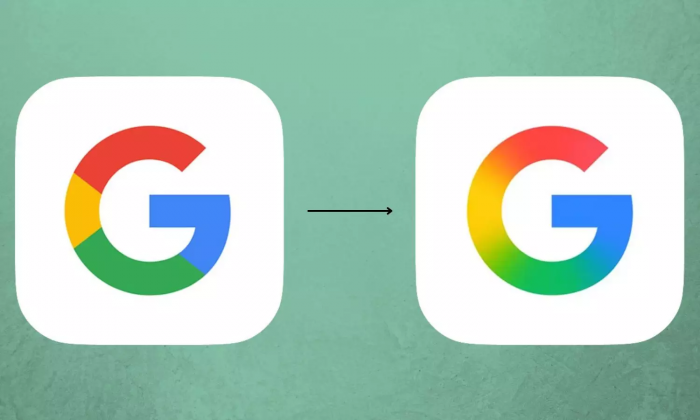
The core structure of the “G” remains the same—it still features the four familiar colors: blue, red, yellow, and green. However, instead of being made up of solid color segments, the updated design introduces a gradient effect. This means the colors now blend smoothly into one another, creating a more fluid and modern appearance.
It’s a shift from a blocky, flat look to something that feels softer and more dynamic. This change mirrors broader trends in design where companies are leaning into gradients, rounded edges, and more natural visual transitions.
Where Can You See It?
So far, the new “G” is rolling out slowly. It's currently visible on:
- The Google Search app on iOS
- Some Pixel devices
- The beta version of the Google app on Android
If you don’t see it yet, you likely will soon as Google continues updating its platforms.
Why Now?
The last time Google redesigned the logo was in 2015, when it adopted a more modern sans-serif font and introduced the colorful “G” icon. Now in 2025, the tech landscape has evolved significantly, especially with the rise of artificial intelligence. Google is aiming for a design language that matches this shift.
The new logo aligns visually with Google’s recent AI tools, especially its Gemini assistant, which also uses a gradient look. By updating its branding, Google is trying to create a more consistent and futuristic feel across all its services.
What Are People Saying?
Online reactions have been mixed, but lively. Some users noticed the change immediately and praised Google for refreshing its branding without overdoing it. They appreciated the smoother, cleaner design and how it reflects Google's shift toward more advanced technologies.
Others, however, didn’t even notice the update at first glance. On platforms like X (formerly Twitter) and Reddit, people joked that Google made a “spot the difference” game out of its own logo. One user wrote, “Did they just turn the saturation up a notch?” Another commented, “I thought my phone’s brightness was acting up!”
Despite the playful confusion, many agree that the new logo feels more in line with current design trends. It may not be revolutionary, but it represents how even small visual changes can help a company evolve while staying familiar to its users.
What’s Next?
This update could be the beginning of a wider visual refresh. Design experts believe Google might soon roll out similar gradient treatments to other popular apps like Gmail, Maps, Chrome, and Google Drive. That would help create a more unified look across its entire ecosystem.
For now, the new “G” is a small but clear signal that Google is still evolving, both in design and technology.
Post Comment
Be the first to post comment!